
Category: Map of the Month
June Map of the Month
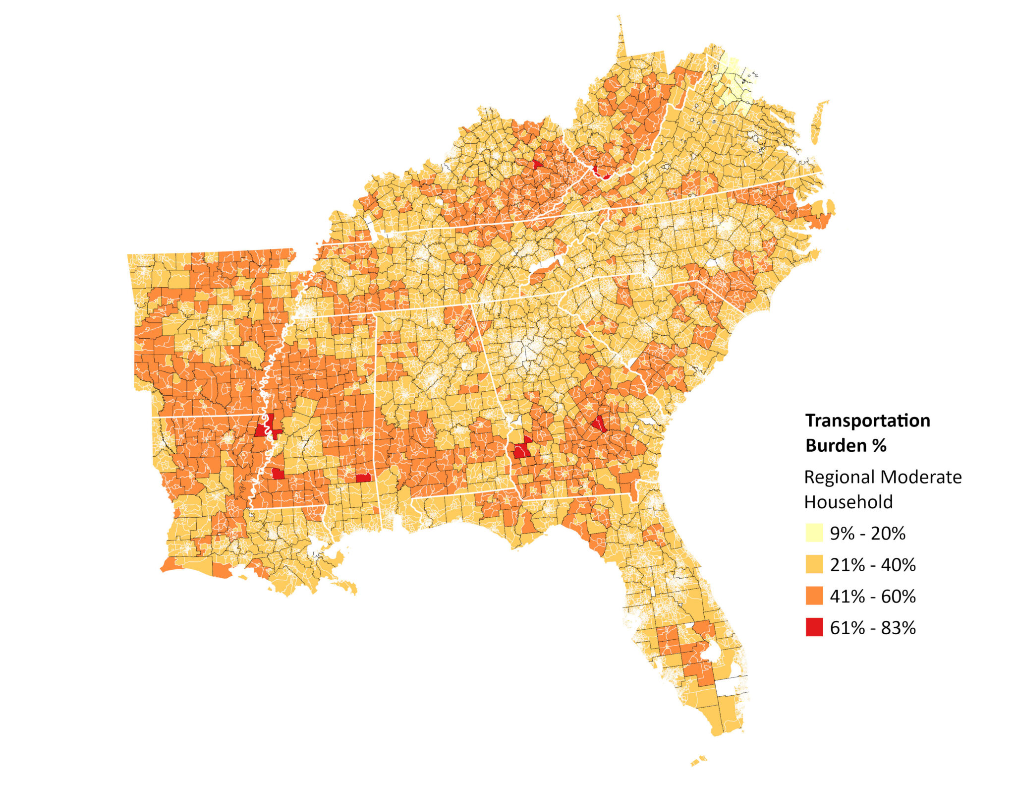
Transportation Costs and Burdens Across the Southeast
Transportation Costs and Burdens Across the Southeast
Source: Center for Neighborhood Technology
Transportation is a vital household need. Without access to reliable transportation, people may struggle to hold down a job, get their kids to school, get groceries, and obtain medical care. We live at a time when there are more forms of transportation available than ever before, but often transportation access is defined by affordability and the built environment.
A household is considered transportation burdened when it spends 15% or more of its annual income on transportation. The widely accepted threshold for combined housing and transportation affordability is 45% of household income, with no more than 30% going to housing and 15% to transportation. Yet a recent U.S. Bureau of Labor Statistics report found that in 2024, American households spent an average of 50% of their income on housing and transportation combined, well above that threshold.
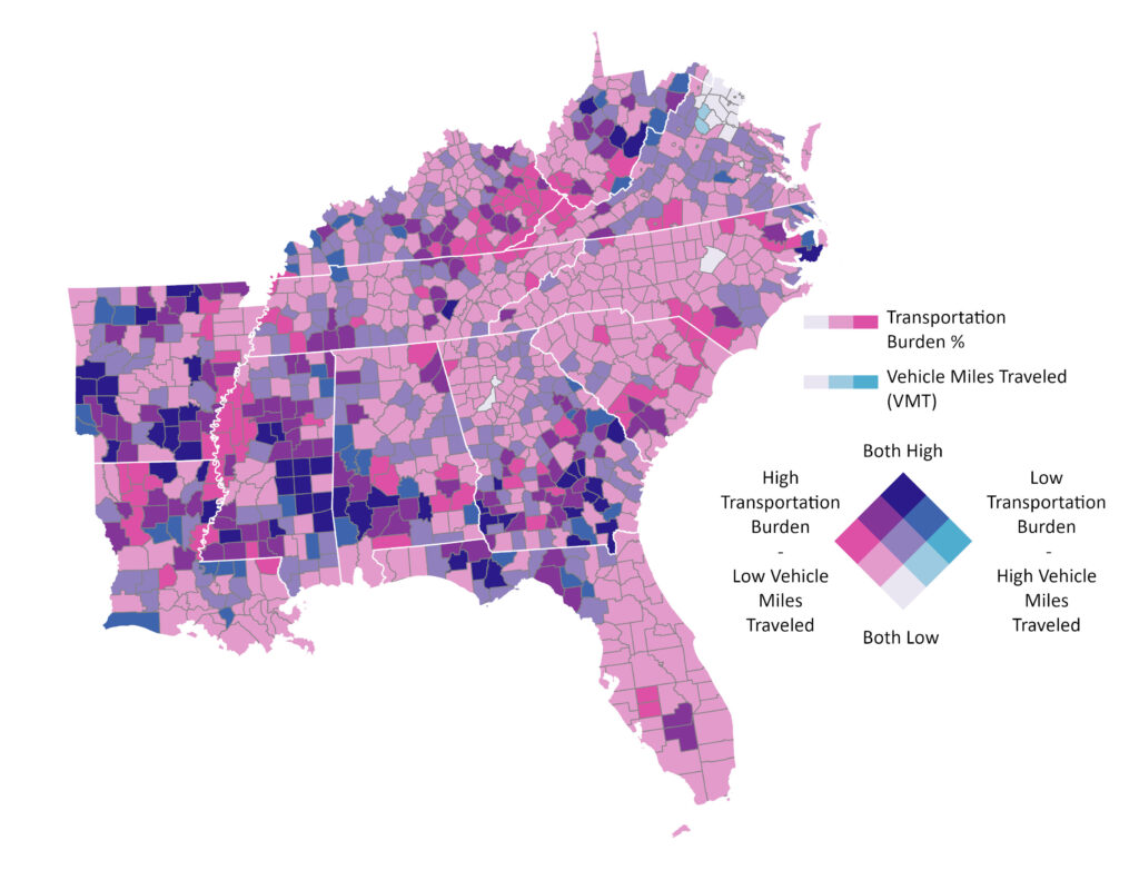
This month’s map draws on data from the Center for Neighborhood Technology’s (CNT) Housing and Transportation (H&T) Affordability Index to visualize transportation burden and annual vehicle miles traveled for moderate-income households across the Southeast. As CNT describes it, the H&T Index expands the conventional definition of housing affordability (rent and utilities) to include transportation costs, so that households and policymakers better understand the true cost of where people live. The model captures costs across three categories: auto use, auto ownership, and public transit use.
In the Southeast, the most transportation-burdened households are concentrated in rural areas along the Appalachian Mountains, the Mississippi Delta, and in the Black Belt, where limited transit infrastructure and low-density development make car ownership not a choice but a necessity. The 13 most highly burdened census tracts fall across West Virginia, Kentucky, Louisiana, Mississippi, and Georgia.
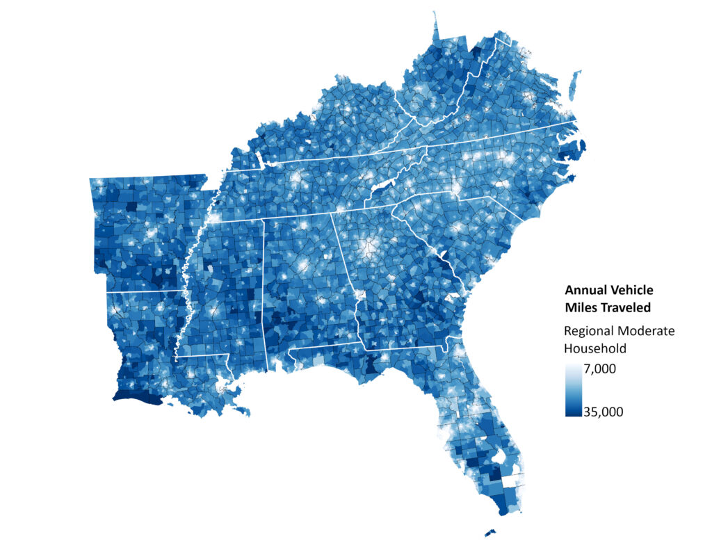
Vehicle miles traveled data confirm what the burden maps suggest: Urban areas are the most transportation-efficient locations, where density and transit access reduce dependence on personal vehicles.
A 2024 study published in the Journal of Transport Geography found that, compared with urban areas, rural areas in the United States have less connected pedestrian, bicycling, and transit infrastructure. Rural residents also tend to travel longer distances to access essential services and opportunities, resulting in a form of “forced car” reliance. At the same time, lower incomes and higher poverty rates among rural populations can increase the financial burden of transportation.
These local patterns are compounded by a national surge in transportation costs since 2020. New car prices have risen approximately 29% since March 2020, while used car prices have climbed about 34%, both outpacing overall inflation, as shown by the consumer price index (CPI) charts below.
Car insurance costs have also risen 56% since January 2020, according to BLS data, though premiums saw a slight dip in 2025. For households that rely on gasoline, costs have been particularly volatile, as pump prices remain susceptible to geopolitical disruptions and global supply shifts.
These affordability issues strain household finances most for low- and moderate-income households in the Southeast, who have the highest vehicle miles traveled (VMT) and experience the highest transportation burdens. Faced with these pressures, many consumers are turning to used electric vehicles as a more affordable alternative.
Taken together, these findings provide a data-driven lens for identifying where transportation burden is most acute in the Southeast and where targeted investments, whether in transit service, pedestrian and bicycling infrastructure, EV infrastructure, or land use policy, can have the greatest impact.
SEEA’s Energy Efficient Transportation portfolio works to address these challenges across the Southeast through EV policy guidance, utility electrification programs, and technical assistance to help states and communities expand access to cleaner, more affordable transportation options.
Data Considerations
The maps here draw on CNT’s 2022 data, which remains among the most comprehensive available. Yet many national datasets do not track transportation burden at a granular level, and key sources like the U.S. DOT’s Local Area Transportation Characteristics for Households (2017) and HUD’s Location Affordability Index (2019) predate the cost spikes we have seen since 2020. As transportation costs continue to shift, updated and locally specific data will be essential for planners and policymakers to understand the true scale of the affordability crisis facing our region.
May Map of the Month
Where the contractors aren’t: mapping workforce deserts in the Southeast
By: William Bryan
Of all the barriers to scaling energy efficiency (and there are many), none are as fundamental as having people who can do the work. Yet throughout the Southeast, the workers who are essential to carrying out energy efficiency upgrades don’t exist in meaningful numbers, especially in communities where they are needed the most.
This month’s map makes this problem visible by mapping contractor deserts across the Southeast. Using data from the U.S. Department of Energy’s 2025 U.S. Energy and Employment Report (USEER) and the Census Bureau’s American Community Survey, we calculated the number of efficiency workers per 1,000 housing units for every county in the Southeast. To gauge how this workforce aligns with housing needs, we estimated local housing upgrade need by layering in data on the age of housing and household income.
Across the Southeast, there are roughly 429,000 upgrade-relevant workers who serve around 38.5 million homes, one worker for every 90 households. But this masks wide disparities in access to skilled workers throughout the region.
We found 190 counties across the Southeast that are in “crisis,” where high housing upgrade demand meets low workforce capacity. Even where they are not actively facing a labor crisis, more than half of all counties in the South are either at risk of becoming, or already are, workforce deserts. Across all desert and at-risk counties, the ratio is one worker for every 206 homes, with a ratio of one for every 411 homes in the most severely underserved counties.
Geographically, workforce deserts are concentrated in Appalachia and the Black Belt regions. “Crisis” counties are especially prevalent in eastern Kentucky and virtually all of West Virginia, where high rates of older housing and limited financial resources have contributed to a housing stock in need of upgrades. These are also communities without a contractor market robust enough to serve this need, a result of the lack of local projects, travel distances from larger markets, and low household incomes that cannot sustain significant projects. Kentucky leads the Southeast with 33 counties in crisis, followed by West Virginia with 32. Taken together, just these two states make up a third of all crisis counties in the Southeast.
The other major concentration of crisis areas runs throughout western Mississippi, northern Louisiana, rural Arkansas, and the Black Belt of Alabama. Like Appalachia, these communities have aging housing, deferred maintenance, and a contractor market that is insufficient to meet local upgrade needs. Louisiana’s Evangeline Parish, for instance, has around 20 home upgrade workers serving 14,500 homes, or one per 726 households.
In Dallas County, Alabama, just 80 workers serve nearly 19,000 housing units. This shortfall is especially stark given that 39% of all housing in Selma was destroyed by a major tornado in 2023. Despite initiatives from Alabama Department of Economic and Community Affairs (ADECA), the City of Selma, and the U.S. Department of Housing and Urban Development (HUD) to fund and support disaster recovery and home upgrades, these efforts require more workers than currently serve the community to meet the scale of need.
It is worth noting that our analysis likely understates the problem. The data we are using locates workers where their employers are based, not where they actually perform work, which means that rural communities surrounded by stronger retrofit markets in nearby cities may appear better served than they are. We crosschecked these findings with a dataset from the U.S. Census Bureau that tracks workforce mobility and found a consistent picture. In some states, this data showed that construction workers who live in rural areas regularly commute to urban markets where there is ready work and available capital, rather than serving their home communities.
The outlook for communities who face workforce shortages is not improving. The uneven programmatic and financing landscape for home upgrades may drive contractors to serve higher-income markets, while exacerbating deferred maintenance and expanding upgrade needs in the places least equipped to address them.
At the federal level, programs that have traditionally supported weatherization, retrofit financing, and workforce development – such as the Weatherization Assistance Program (WAP), the Energy Efficiency Home Improvement Tax Credit (25C), and the Training for Residential Energy Contractors (TREC) grants program – have been proposed for elimination or already cut.
Meanwhile, the construction workforce is aging, with almost 15% of the industry reaching retirement age in the next decade. This will place further stress on underserved and even adequately served areas if these workforce gaps are not filled.
We believe that these findings point to three conclusions for program designers, funders, and policymakers working to close the contractor gap in the Southeast and expand access to energy efficiency:
First, Appalachia and the Black Belt should be priority geographies for workforce development investments. Crisis counties in these areas have the most significant overlap between housing need and a lack of workforce capacity in the Southeast. They are least likely to be reached by market solutions or programs designed for communities with a more robust workforce, and they must be engaged on their own terms.
Second, retraining existing workers is a key short-term opportunity. When we used the broadest definition of the energy efficiency workforce (including all HVAC workers, not just those working on high-efficiency equipment), 99 counties looked adequate despite being contractor deserts when the focus was turned to upgrade-relevant workers. This suggests that these areas have contractors who are doing conventional HVAC work but could be trained to perform high-performance retrofits like heat pump installations.
Finally, closing workforce gaps requires a sustained, place-based strategy. SEEA has deep experience working on this through research, policy, and workforce development initiatives across the Southeast. At a local level, we have leveraged our research to work with municipal partners and community-based organizations on a range of workforce development initiatives. This includes working with the City of Selma, Alabama, and Southface Institute to train building officials, as well as a successful multi-year program to train underserved contractors in Georgia, with the Georgia Hispanic Construction Association (GHCA), Gwinnett Housing Corporation, and Lucky Shoals Community Association. At a regional level, SEEA has led multiple statewide studies of building activity and has provided education to building officials and contractors in seven states through our Building Energy Code Circuit Rider Program. Finally, we have also engaged new stakeholders to address workforce gaps through collaborative research and policy engagement through our Southeast Energy Insecurity Project (SEIP) and BRESE Collaborative.
These efforts have built critical workforce infrastructure throughout the South, but as our contractor desert maps show, there is still much work to be done. Mapping the problem is the first step. Connecting these maps to last-mile solutions is the work ahead.
April Map of the Month
By: Amy Lovell
Energy Efficiency Workforce Needed to Meet Growing Energy Demand
Energy demand is growing across the U.S., driven by new and larger data centers, energy-intensive manufacturing, and electrification of homes, businesses, and vehicles. While the electric grid and power generation facilities must expand to meet that need, power demand can also be managed through energy efficiency solutions. These are time-tested approaches, and significant load reductions can result from reducing system losses, deploying more efficient technologies, optimizing processes, and making strategic energy‑use decisions. Whether it is infrastructure expansion or demand side management, all approaches to meet energy demand require growth in the workforce across the growing energy sectors.
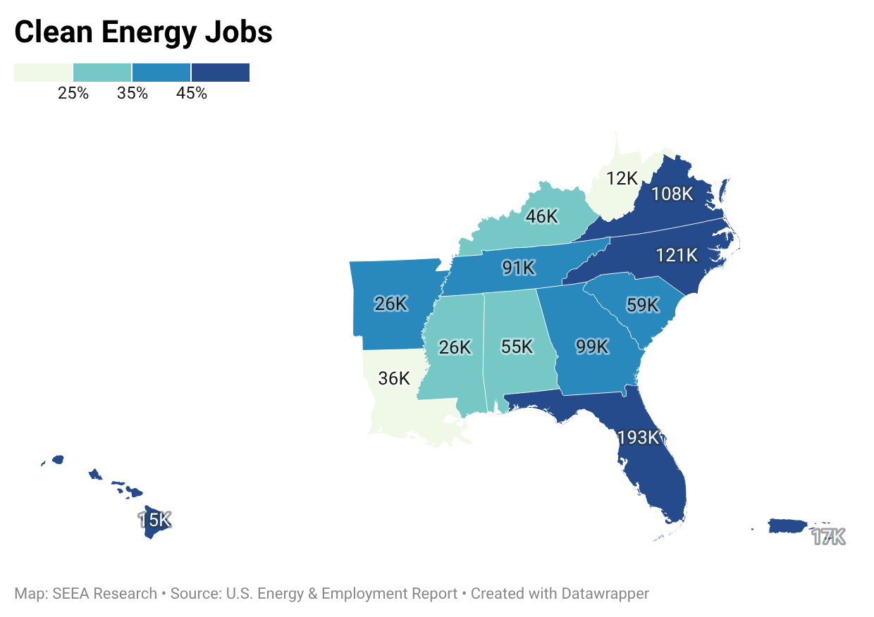
The 2025 U.S. Energy and Employment Report (USEER) and analysis in the report Clean Jobs America 2025 present the status of the energy workforce as a whole, and in the clean energy industry in particular. Based on data from the 2024 calendar year, the U.S. Energy sector employed 8.5 million workers, 2.1 million of which were in the Southeast and U.S. islands.
The median wage for energy employment is $58,810 per year, 18.8% higher than the national median wage, positioning the energy industry as a strong career choice. Clean energy jobs, including renewable power generation and fuels, alternative fuel vehicles, energy storage, electric grid innovations, and energy efficiency, form 42% of the energy workforce in these states and territories. Significant growth continued through 2024 with employers across all technologies reporting expected growth in the numbers of workers needed by the industry through 2025.
Energy efficiency roles formed 27% of the energy workforce in 2024: 394,000 jobs in the Southeast and islands. Energy efficiency is a critical partner in addressing growth in energy demand, because these innovations alleviate the need to build new power generation facilities, compensating for load growth by reducing power consumption before it is used. The American Council for an Energy-Efficient Economy (ACEEE) estimates the median cost of energy efficiency programs is $21/MWh, significantly below the cost of any other form of supplied energy, and much faster to deploy.
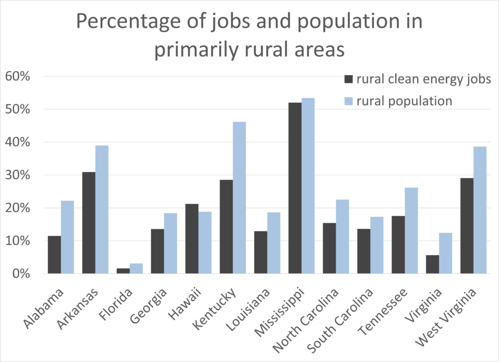
Given these benefits of energy efficiency, and for strong employment potential, how can we support a healthy workforce pipeline? 49% of employers both nationally and in this region reported that hiring was “very difficult” or “somewhat difficult.” Workforce development should include small towns and rural areas, where the portion of the general population is larger than the portion of clean energy jobs in those areas: on average, 28% of the population lives in communities that are 50% or more rural, but only 21% of the clean energy jobs are in these areas. Workforce needs can be met by training new workers, or adding professional development opportunities for existing workers, particularly in roles that are growing and needed everywhere people live, such as solar power generation, electric transmission and distribution, building efficiency, or electric vehicle charging. Having a geographically dispersed, well-trained contractor workforce increases the likelihood that employees can live closer to their jobs, while enabling energy projects to be delivered more quickly in the communities they serve. Growing enrollment in technical certificate and trade programs signals strong interest in workforce training, while highlighting the need for local outreach and supports that help students find and complete these programs.
March Map of the Month
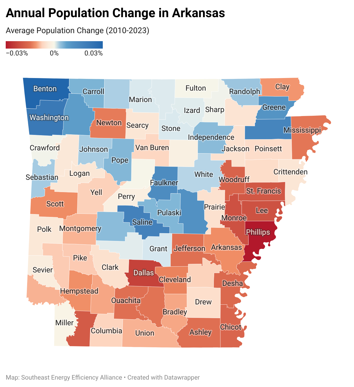
Growth and Energy Burden in Arkansas: A County Comparison
By Laura Diaz-Villaquiran
Data: U.S. Census Bureau ACS (2020–2024); U.S. Energy Information Administration (EIA); U.S. Department of Energy LEAD Tool
Across Arkansas, patterns of population change and energy burden are closely connected. The state consumes nearly 60% more energy than it produces, and while its electricity prices are among the ten lowest nationally, affordability varies widely depending on income, housing quality, and local economic conditions. For many low-to-moderate income households, energy costs still represent a significant share of monthly expenses.
This analysis examines how population change intersects with energy burden statewide. Communities experiencing growth generally benefit from newer housing stock, active labor markets, and expanded economic opportunity factors associated with lower energy costs relative to income. Declining communities, by contrast, often contend with shrinking economies, aging and inefficient housing, and elevated energy burdens that compound existing hardship.
A Tale of Two Counties:
In Arkansas, Benton County and Phillips County illustrate these differences. Benton County, located in northwest Arkansas, has experienced sustained growth, with a population increase of 17% between 2020 and 2025. This growth is supported by a strong labor market, with employment increasing by 7.1% between 2022 and 2023, and significant residential development, with 4,453 building permits issued in 2024.
Benton County also has a more diverse population, with 12.7% foreign-born residents and 15.8% of households speaking a language other than English at home. In Benton, the median household income is $93,506. Homeownership is relatively high at 67%, and 94.4% of households have broadband access. Median monthly housing costs include $1,717 for owners with a mortgage and $1,277 for renters.
Phillips County, located in the Mississippi Delta, presents a different picture. The county experienced a population decline of 13.7% over the same period, alongside a 5.2% decline in employment between 2022 and 2023 and only 16 building permits issued in 2024.
Phillips County is 61.8% Black, 34.5% White, and 2.5% Hispanic or Latino, with a much smaller foreign-born population than Benton County (1.5%).
In Phillips County, the median household income is $40,134, and 35.8% of residents live in poverty, over four times the rate of Benton County.
Homeownership stands at 51.2%, and 79.3% of households have broadband access. The median gross rent in Phillips is $737, reflecting lower housing costs but also lower incomes and limited economic opportunity for its residents.
Energy costs represent a disproportionately large share of income for Phillips County residents. Low-to-moderate-income households carry an average energy burden of approximately 12%, double that of Benton County. Energy poverty researchers define energy burdens of 6% to be high and burdens above 10% severe.
These differences underscore deep regional disparities in the Arkansas–Mississippi Delta, where counties such as Ashley, Chicot, Lee, and Mississippi experience a compounding cycle of population loss, elevated poverty, and severe energy burdens.
SEEA’s work focuses on these regional differences by bringing together cross-sector partners to align data, programs, and policy. Insights like these help target energy efficiency investments, inform workforce development strategies, and support solutions that improve affordability and resilience. By connecting data to action, this approach supports more consistent and measurable progress across communities in the Southeast.
February Map of the Month
By Will Bryan

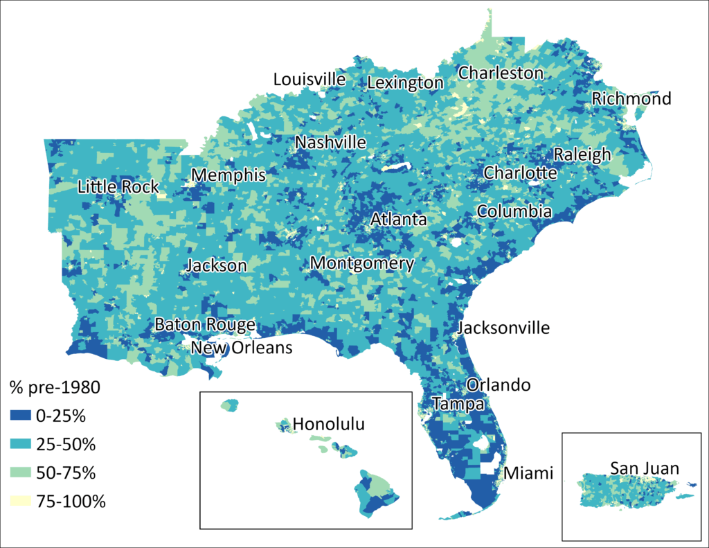
Housing in the Southeast is aging, and the cost of living in it is getting more expensive. As we noted last month, around 40% of housing in the region was built before 1980, when the nation’s first minimum standards for energy efficiency were implemented. For residents of older homes, occupancy can come with an unexpected tax: the high costs of deferred maintenance and inefficiencies, not to mention the health and safety impacts of living in substandard housing.
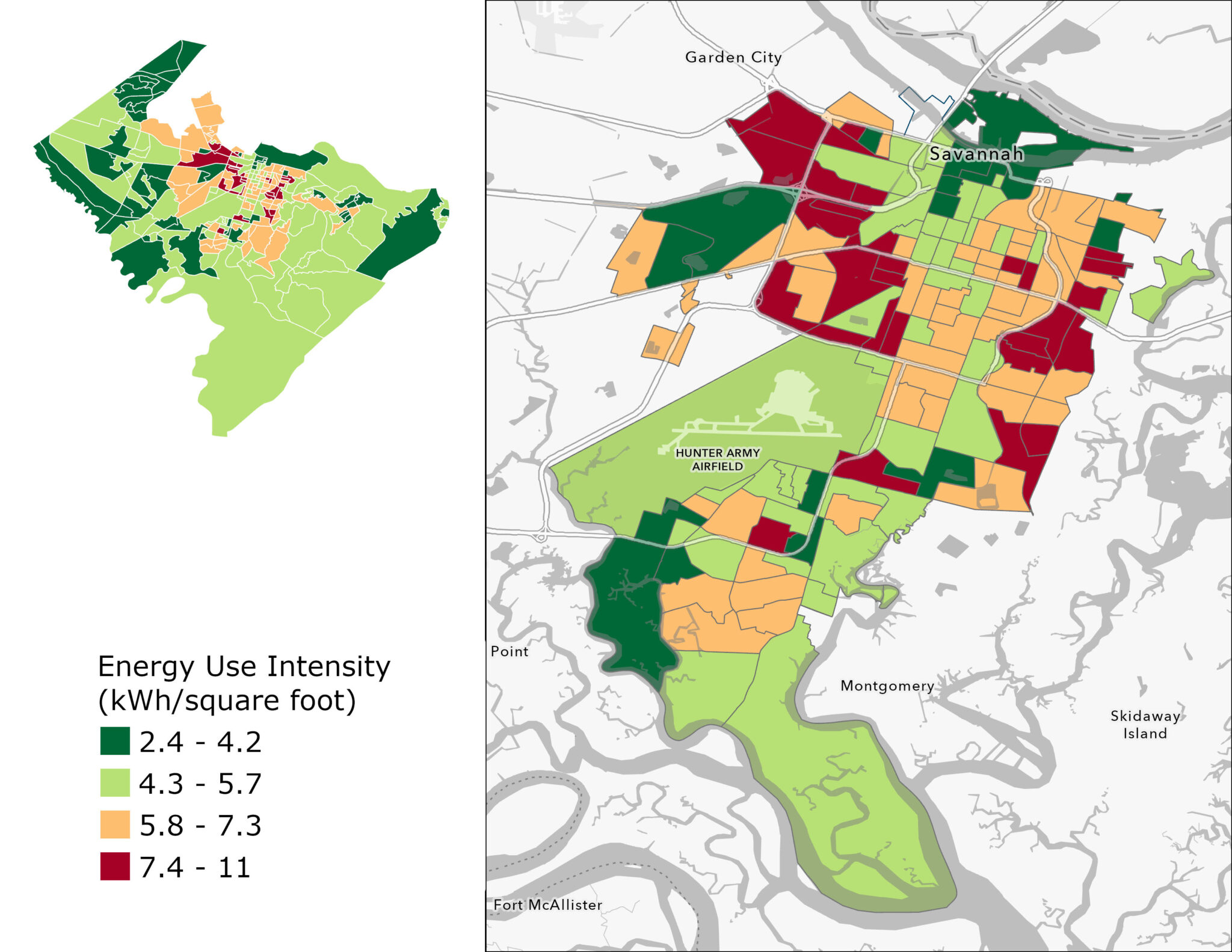
These burdens are not distributed equally. In this month’s map of the month, we assess the quality of housing in Savannah, Georgia using the metric of energy use intensity (EUI), a measure of energy use per square foot. EUI is a helpful proxy for housing quality and efficiency. Higher EUIs signal leaky buildings with heavy heating and cooling loads, while low EUIs indicate more efficient spaces. By modeling heating EUI at the census block group in Savannah, Georgia – a city where the housing stock is older than the state and regional average – we show where efficiency gaps are the widest and shed light on which communities are shouldering the impacts of our aging housing.
As the map shows, EUI varies considerably across the City of Savannah. The most efficient households in the city use more than 4.5 times less energy per square foot than the least efficient households in the city, which translates into considerable monthly cost savings.
The highest EUIs are concentrated on the outskirts of the historic district. While the housing here is nearly as old as that in the city’s core, these neighborhoods have had fewer resources available for retrofits and upgrades. The result is that it is less likely that homes in these areas have been retrofitted and they are more likely to experience the impacts of deferred maintenance.
In Savannah, these issues are shaped by the legacies of the South’s long history of residential segregation. As the chart below indicates, block groups in the city with the highest EUIs all have majority Black populations, while census block groups with the lowest EUIs are all majority white. Additionally, homes in areas with low EUIs tend to be newer than the typical home, benefiting from modern construction techniques and minimum standards for building efficiency. This showcases the ways that segregation, a lack of housing choice, and unequal access to capital over the past century continue to circumscribe who has access to healthy and efficient housing today.


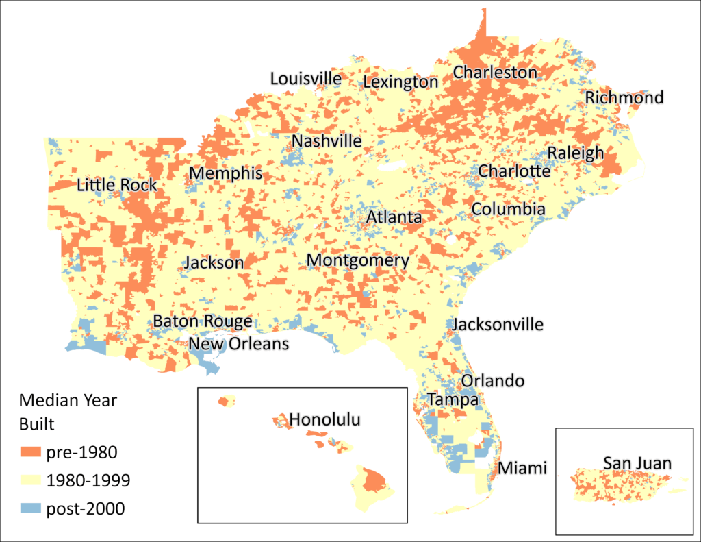
January Map of the Month
Aging Homes, Rising Energy Costs
By Amy Lovell, Ph.D.

Escalating household energy costs have increased the urgency of energy and housing affordability and drawn attention to the influence of housing characteristics on energy efficiency. Housing age is a major driver of home energy usage and costs, particularly if the home was constructed to lower building standards or is in need of major repairs. In 2020, 27% of households across the U.S. struggled to meet energy needs, and in some areas, that percentage is even higher.
One of the most critical factors influencing the efficiency of housing is the year of construction, as building technologies and code requirements have evolved over time. In the Southeast, approximately 40% of homes were built before 1980, when energy codes started to be required in some jurisdictions nationally. Though only 5% of homes were built in 1939 or earlier, and 14.8% of homes were built before 1960, this still represents 1.9 million and 6 million residences, respectively. Less than 30% of southeastern homes were built after the year 2000.
This month’s map illustrates the percentages of southeastern homes that were built over different time spans, and the median year of construction. Data are estimated at the census tract level, representing 40 million homes in the region, based on the U.S. Census Bureau’s American Community Survey (ACS) from 2023.
Rural areas tend to have a higher proportion of older homes (indicated on the map in darker shades of blue), while areas near cities that have experienced significant growth tend to have a higher proportion of newer homes (indicated in lighter green and yellow). In some rural communities, 40% or more of the homes were first constructed before 1960. Unless those homes have been renovated or had intentional upgrades to energy efficiency, the residents likely experience high energy costs.
For an older home, a comprehensive energy efficiency upgrade – which may include sealing air leaks around doors and windows, adding additional attic or wall insulation, replacing windows or doors, or upgrading heating/cooling systems and thermostats – can save 10-30% on annual energy costs. It is useful for states, counties, and municipalities to know where the majority of residents are living in older homes that could benefit from some attention.
While new construction will typically be built to comply with greater energy efficiency standards, those requirements vary across the region. In Florida, Louisiana, and Virginia, the building energy codes are more favorable to efficient new construction, while in some other states in the region, building standards are 15-20 years behind the most modern standards. The U.S. Department of Energy determined that upgrading building energy codes to the most recent (2024) International Energy Conservation Code (IECC) would result in 7-8% in residential energy savings over the 2021 code, and upgrading older codes holds even greater potential, but only for newly constructed homes.
Older homes may have undergone significant renovations and upgrades to energy efficiency, either as older components were replaced after failure, or in a more comprehensive upgrade targeting energy savings. As a result, many newer homes will operate more efficiently and cost less in annual energy expenditures, but older homes of any age may be much more efficient than others of the same vintage. Home renovation is a major industry, including do-it-yourself and professionally-installed projects (including but not limited to energy upgrades), with total homeowner remodeling spending expected to exceed $500 billion in 2026.
An additional challenge for residents of older homes, particularly for families with limited financial resources, very high energy costs, or significant deferred maintenance projects in the home, is the additional cost of repairing existing damage and preparing the home to benefit from energy efficiency improvements. As increasing energy demand influences household energy costs across the region and the nation, the number of households paying more than 10% of their income on energy bills will continue to grow from the current 12%. National, state, utility, local, and philanthropic funding programs are working to fill these gaps, but in most locations the need greatly exceeds the available funds. For example, SEEA is conducting a pilot program with microgrants to help nonprofits, small businesses, and municipalities who are supporting residents in applying for these programs in five states. States and municipalities can also continue to review and update their building energy codes so that newer housing can operate as efficiently as possible.

November Map of the Month
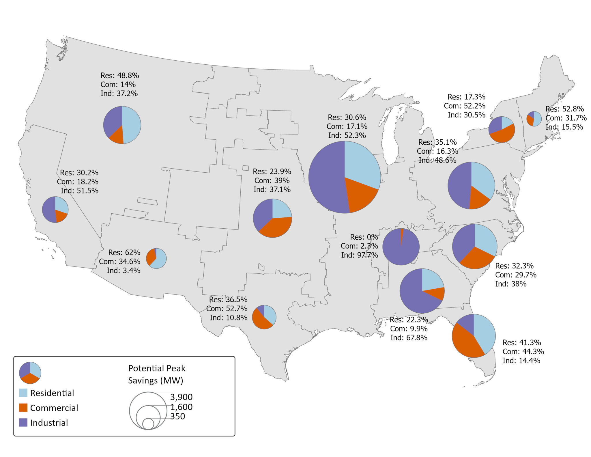
By Will Bryan

It’s no secret that projected electric loads throughout the nation are unprecedented, but particularly in the Southeast. A recent analysis by ICF estimates that U.S. electricity demand will grow by 25% in the next four years, and 78% by 2050, compared to a 2023 baseline. Much of this load growth will happen in the Southeast, driven by a combination of electrification and the siting of large commercial customers.
Many electric utilities are considering building new generation to manage this unprecedented growth; load flexibility, however, will be a critical tool to maintain grid stability, promote customer affordability, reduce the environmental impacts of generation, and ensure that we have the energy to meet all our needs.
This month’s map uses data from the U.S. Energy Information Administration (EIA) to explore the state of utility-administered demand response programs in 2024, the most recent year data was available. Demand response refers to a range of programs that are designed to reduce customer usage during peak events, including through the installation of smart thermostats or variable pricing, among others.
Utilities of all types have enrolled 2.7 million residential, commercial, and industrial customers in demand response programs across the South. These programs have created the capacity to save approximately 13.34 GW of peak energy use. In 2024, demand response reduced the peak demand by 2.89 GW, the amount of power generated by about three nuclear reactors. Utilities in the Midwest, mid-Atlantic, Carolinas, and Southeast balancing authority regions lead the nation in terms of potential peak capacity reductions available through demand response programs.
As the pie charts in this month’s map show, utilities take different approaches to balancing their programs across multiple sectors. While peak savings in the Southern and Tennessee balancing authority regions are driven largely by the industrial sectors (seen in purple on the pie chart), other parts of the South, such as Florida and the Carolinas, show a greater reliance on residential and commercial demand response approaches.
Demand response is transformational work. It stabilizes the grid during critical events and protects customers from the costs of new infrastructure investment. However, to meet future load projections, these programs must be scaled up rapidly to help meet the projected need.
Expanding demand response offers additional peak-shaving capability, especially when paired with energy efficiency and other distributed energy resources. Demand response is a proven, effective tool. The challenge now is to scale it to meet the emerging demand.
October Map of the Month
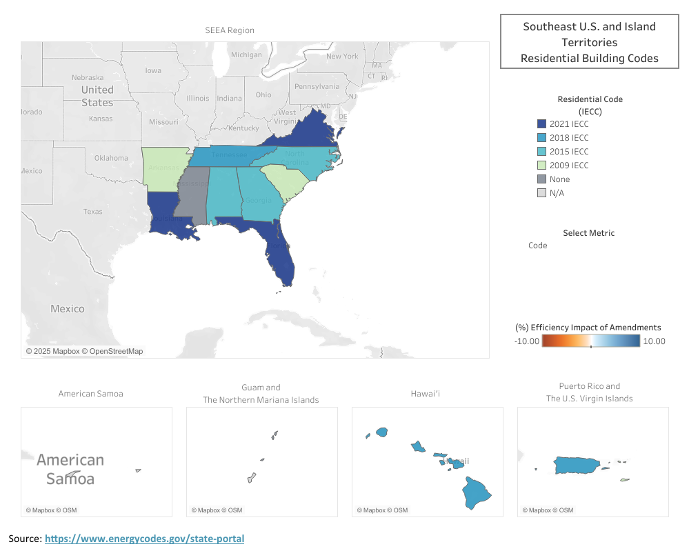
Beyond Adoption: Measuring the Efficiency Impact of State Amendments

Code: The model energy code edition that a state has officially adopted — IECC for residential buildings or ASHRAE Standard 90.1 for commercial buildings.
Strength: The actual rigor of that code after state amendments — shown as the equivalent edition it matches and the percent change in efficiency compared to the unamended base.
Impact (Δ%): The efficiency impact of amendments on the strength of the code — negative values mean the code was weakened, positive values mean it was strengthened.
Code Adoption
Modern building energy codes were born from the 1970s energy crisis, when the U.S. first recognized the need to make buildings part of the nation’s energy solution. Congress passed the Energy Conservation and Production Act of 1975, prompting ASHRAE to release Standard 90-1975, which was the first model energy standard for both residential and commercial buildings. What began as a response to oil shortages evolved into a national framework for improving efficiency, lowering energy bills, and creating healthier indoor environments.
Today, two model codes define energy performance in new construction: the International Energy Conservation Code (IECC), developed by the International Code Council (ICC), which applies to most low-rise residential buildings; and ASHRAE Standard 90.1, maintained by ASHRAE’s Standing Standards Project Committee 90.1, which governs commercial and multifamily buildings four stories and higher. Both are updated every three years through consensus-based processes that integrate advances in materials, technology, and design.
States adopt these model codes to establish consistent, verifiably effective standards for energy-efficient building design and construction. Using a national model allows jurisdictions to align with proven energy and cost savings while reducing the administrative burden of writing their own code from scratch. Each adoption cycle marks an opportunity to bring new buildings closer to the long-term goals of efficiency, affordability, and resilience.
Amendments
Once a model code is adopted, many states modify it through state-specific amendments that tailor how the code is applied or enforced. Amendments can adjust performance requirements or provisions to accommodate local market or climactic conditions.
States may amend for several reasons: to reflect regional climate, to balance cost and feasibility, or to harmonize with existing state policies. Some strengthen efficiency – tightening envelope requirements or improving lighting and controls – while others weaken it by relaxing testing standards or allowing lower equipment performance.
For example, several states in the Southeast have adopted the 2015 IECC with state-specific amendments, which in effect perform closer to the 2009 IECC. These amendments may often be created to help codes pass politically or reduce near-term costs, but often result in lower long-term energy and health benefits.
Impact of Amendments
On paper, a state’s code might appear to meet a recent national standard. In practice, however, amendments can significantly alter its strength, that is, the actual level of efficiency the code delivers. To capture this nuance, analysts from the U.S. Department of Energy’s Building Energy Codes Program use comparative modeling to estimate how amendments shift a code’s effective performance.
For example, a state that adopts the 2015 IECC but introduces multiple weakening amendments may, in effect, deliver energy savings closer to the 2009 IECC baseline. This map is intended to visualize those distinctions through both Code (what’s on the books) and Strength (what’s actually achieved), offering a clearer view of how policy choices translate into real-world outcomes for efficiency and affordability.
To learn more about the DOE’s State Energy Code modeling methodology, visit the link here.
The Impact (%) represents that estimated difference in energy performance caused by amendments alone – negative values indicate a weaker, less efficient code, while positive values reflect stronger-than-standard performance. Together, these measures show not just what code a state has adopted, but what level of efficiency it’s truly delivering.
September Map of the Month
By Amy Lovell, Ph.D.
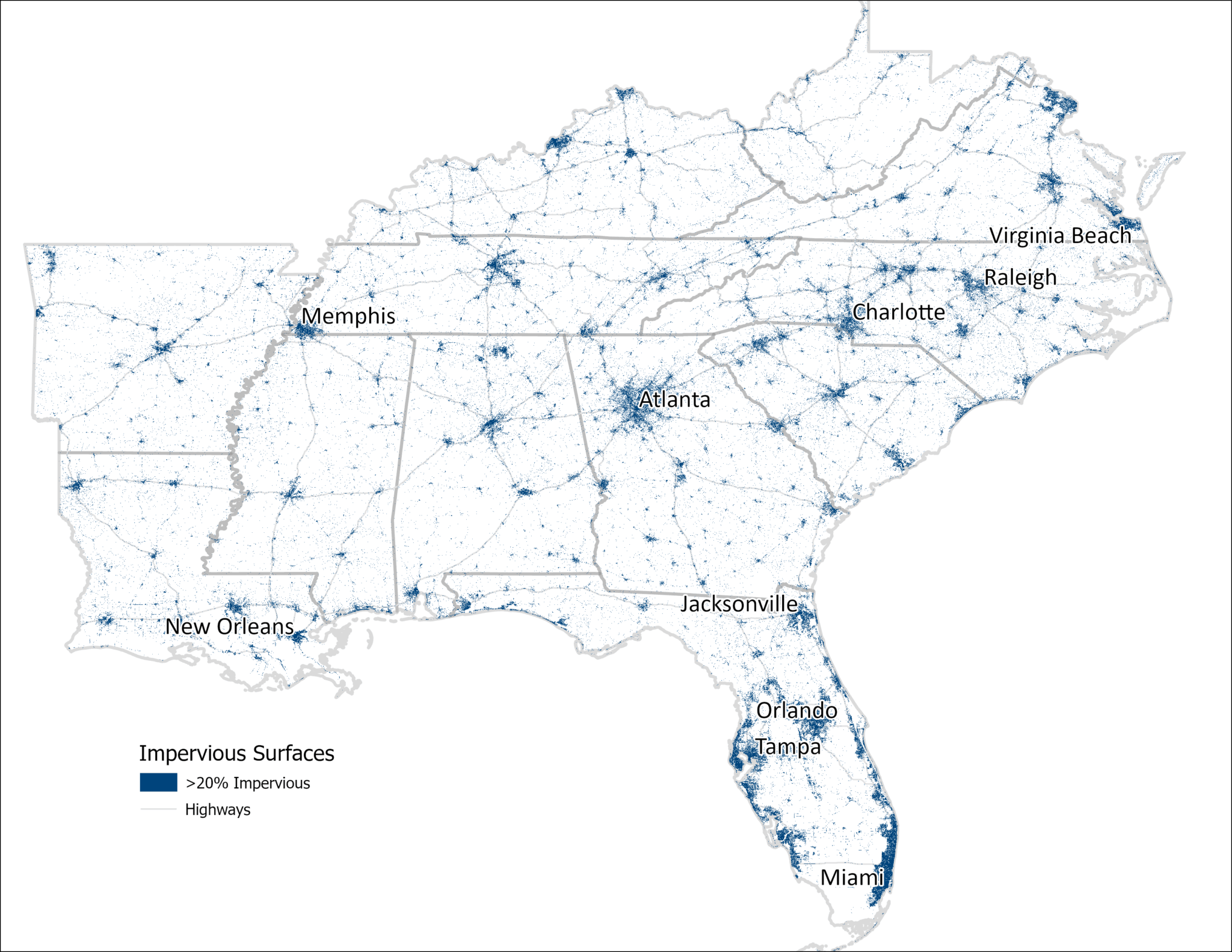
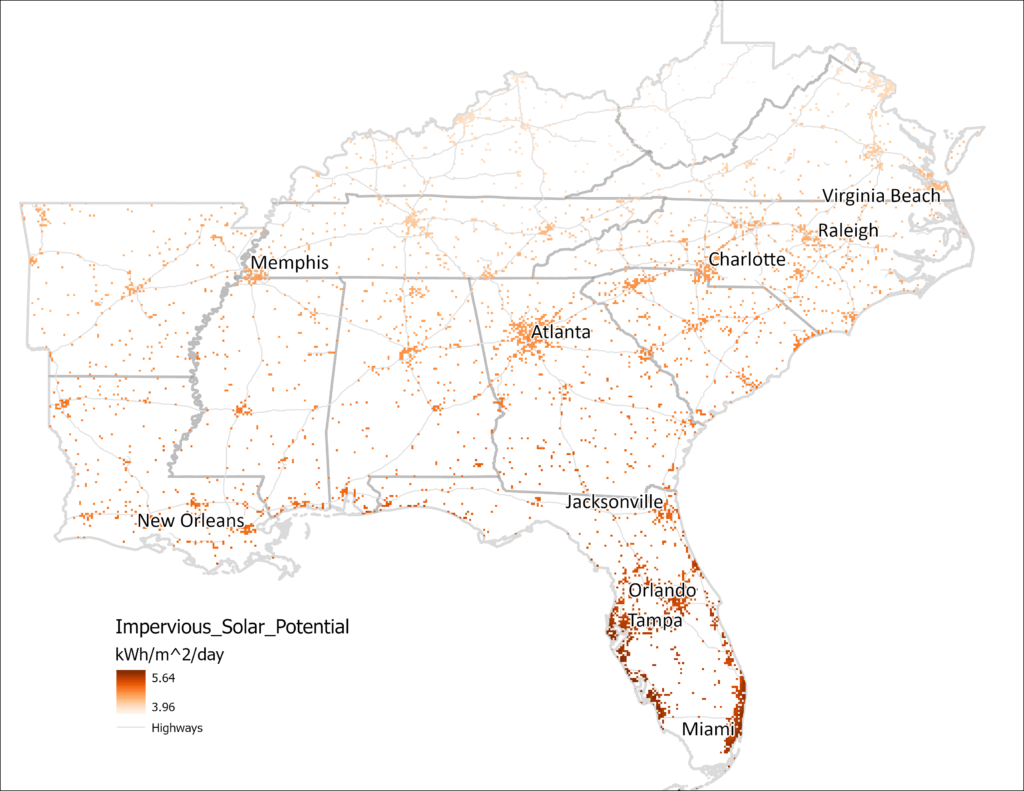
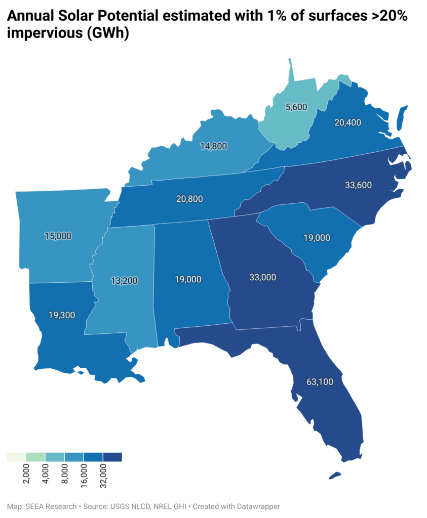
Solar Potential of Impervious Surfaces in the Southeast

Installation of solar photovoltaic panels on even a small fraction of the impervious surfaces in the urban environment in the Southeast could provide a significant boost in energy generation.
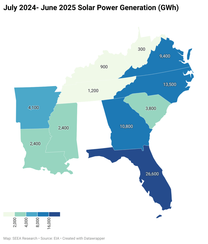
As solar photovoltaic technology has become increasingly affordable for electricity generation, both utility-scale and small-scale solar power (<1MW) have grown. Between June 2024 and June 2025, in the entire United States, solar power generation grew 25.4%. In the Southeast, Arkansas, Kentucky, Louisiana, and Mississippi all increased their solar power generation over 90% during the same period. This increase has raised questions about land use and the potential conversion of agricultural land into solar farms.
While the land area in use for solar power is a tiny fraction of the land in use as farms in the Southeast (and nationwide), it is worth considering what is the potential for solar power on land that is already in use. When land is covered with surfaces such as parking lots, buildings, sidewalks, and roads, water cannot effectively soak into the ground. When it rains, such impervious surfaces limit access to natural infiltration in the soil, which can lead to increased water runoff, flooding, and concentration of pollutants in streams and drinking water. Since solar panels are also impervious surfaces, placing them on rooftops and parking surfaces that are already in the built environment makes dual use of existing structures for supplementary power generation. In this map of the month, we highlight where the impervious surfaces are located in the Southeast and estimate the potential solar power generation capacity of these locations.
Using data from the U.S. Geological Survey National Land Cover Database, we determined the fractional surface area that is covered with artificial structures in our region. We sum the areas where the fractional impervious surface is greater than 20%, yielding 75,000 km2 of land area, shown in navy blue on the map below. Not surprisingly, the highlighted areas are primarily in urban areas and along major highways.
The National Renewable Energy Lab (NREL) provides estimates of the average potential for solar power using global horizontal irradiance (GHI), which is measured in kilowatt-hours (kWh) per square meter per day. In the Southeast, GHI varies approximately from 4-6 kWh/m2/day. If solar panels were deployed over even 1% of the (>20%) impervious surfaces on this map (185,000 acres or 750 km2), at 4 kWh/m2/day, with 20% panel efficiency, the region could generate 219,000 GWh annually. Compare this with 75,300 GWh already generated by solar facilities in these states between July 2024 and June 2025, this one percent could increase the region’s solar power contribution by a factor of 2.8, with enough to power 20 million homes, or approximately half of homes in these states.
Not all impervious surfaces are suitable for installation of solar panels, but adding panels to even a small percentage of the existing infrastructure could provide a significant additional source of electric power, without covering new land at all. This dual use of some of the urban built environment is equivalent to 400 farms at the 2022 average size of 463 acres each. Furthermore, solar panels on existing rooftops or parking lots provide artificial shade that can help to reduce the urban heat-island effect, offset peak electric power demand in urban areas where there is a lot of daytime power demand, and are more readily tied into existing grid infrastructure than panels in more rural areas.
August Map of the Month
By Laura Diaz-Villaquiran
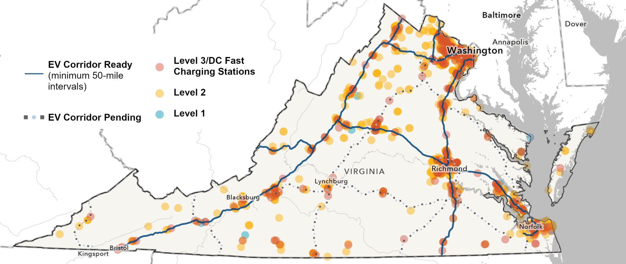
Public EV Charging Stations in the Commonwealth

Source: U.S. Department of Energy, Alternative Fuels Data Center
The U.S. EV charging network has grown from 5,070 EV charging ports in 2011 to more than 184,000 in 2023, a 36-fold increase in just over a decade. This rapid expansion is vital for consumers, who depend on reliable and accessible charging infrastructure. As the U.S. Department of Energy’s Alternative Fuels Data Center (AFDC) explains, while most drivers begin by charging at home or at fleet facilities, public and workplace stations, “help bolster market acceptance by offering more flexible charging opportunities at commonly visited locations.”
This Map of the Month highlights publicly available EV charging stations in the Commonwealth of Virginia, along with the state’s EV-ready and pending fuel corridors. Under the National Electric Vehicle Infrastructure (NEVI) program, previous guidance stated that stations must be located within 50 miles of one another to qualify as corridor-ready, but that has changed.
Virginia’s network is steadily taking shape. Today, the Commonwealth is home to 1,838 public EV charging stations, with a total of 5,316 charging ports. Of these, 344 are Level 3 direct-current (DC) fast charging stations, the highest-capacity chargers available. These stations make long-distance EV travel increasingly practical and reliable, with the AFDC noting that “DC fast charging equipment (typically a three-phase AC input) enables rapid charging along heavy traffic corridors at installed stations at power outputs up to 500 kW.”
Virginia’s interstates serve as a pass-through from the South to the Midwest and the Northeast, making this growing network especially significant for regional and national EV travel. Our map also indicates that charging “hot spots” are concentrated in Virginia’s urban areas, such as Arlington, Alexandria, Richmond, Norfolk, Lynchburg, and Blacksburg. These clusters highlight the state’s progress while underscoring the need to expand access in rural communities.
On February 6, 2025, the Federal Highway Administration (FHWA) announced a pause on the current NEVI Formula Program. But even with this pause, Virginians still have access to a wide range of residential and non-residential utility incentives that are helping to accelerate EV adoption:
- Appalachian Power offers time-of-use (TOU) rates for EV charging, rebates for Level 2 charging station purchases, and infrastructure support.
- Dominion Energy provides rebates and pilot programs for both residential and non-residential charging stations.
- Northern Virginia Electric Cooperative (NOVEC) and Rappahannock Electric Cooperative (REC) both extend TOU rate incentives to residential customers.
- Tennessee Valley Authority (TVA) supports non-residential adoption through rebates for DC fast charging station purchases, installation incentives, and deployment pilot programs.
Together, these programs make it easier for households and businesses to invest in charging infrastructure and alternative fuel options. For the most up-to-date information, the Alternative Fuels Data Center maintains a comprehensive directory of incentives, laws, and regulations available in Virginia.