
Map of the Month – February
Laura Diaz-Villaquiran
Hover over the map to click through the slideshow. Click on image to view full image.
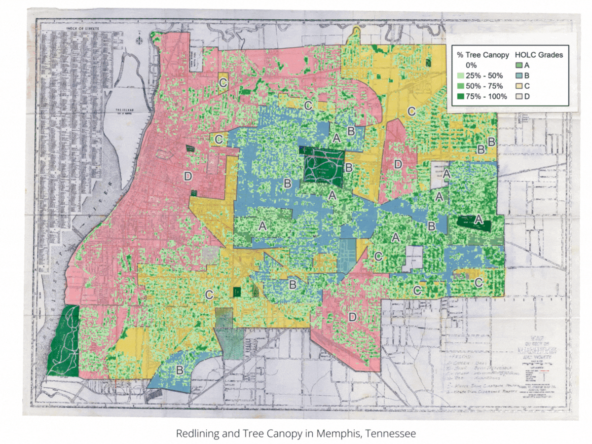
 Redlining and Tree Canopy in Memphis, Tennessee

")

Data Source: Mapping Inequality: Redlining in New Deal America Dataset; U.S. Forest Service Tree Canopy Cover (TCC) Dataset; Maps: SEEA.
Few things have impacted cities today as much as the suite of policies and practices that segregated neighborhoods on the basis of race over more than a century. Housing segregation had existed in practice for decades before the 1910s when white policymakers enacted the first racial zoning laws. Although these laws were declared unconstitutional by the United States Supreme Court in 1917, white city officials throughout the South still found ways to advance racial residential segregation.
In the 1920s and 1930s, segregation was taken up by the federal government in the form of “redlining,” the practice of denying financial lending – particularly for home purchases or improvements – to people based on their race or ethnicity and what neighborhood they lived in. For instance, the federal Home Owners’ Loan Corporation (HOLC) developed a series of maps that used the racial makeup of city neighborhoods to guide mortgage lending practices based on their assessment of the risk of lending. HOLC devised a four-tiered system that characterized neighborhoods in more than two hundred cities as A – best, B – still desirable, C – declining, and D – hazardous. These ratings were largely based on the racial makeup of a neighborhood, with C and D ratings typically having a larger share of racial and ethnic minorities than neighborhoods that rated A and B.
HOLC maps had less of an impact on private markets than often suggested, but they guided Federal Housing Administration (FHA) lending decisions for decades. Beyond that, they are also a spatial reflection of generations of policies and programs that segregated American cities, with far-reaching consequences that still shape cities today.
Using tree canopy cover data from the U.S. Forest Service, this month’s map explores the relationship between redlining and urban tree canopy. In three cities (Columbia, Jackson, and Memphis), we find that formerly redlined neighborhoods have about half the level of tree canopy today than historically white neighborhoods.
In Memphis, Tennessee, formerly redlined neighborhoods have an average tree canopy covering 20% of the neighborhood, while neighborhoods rated “A” have canopies that cover about 43% of their land area. In Jackson, Mississippi, formerly redlined neighborhoods had an average tree canopy of 24%, while neighborhoods rated “A” have 50% canopy cover. In Columbia, South Carolina, formerly redlined neighborhoods had 15% tree canopy, compared to 32% for non-redlined neighborhoods.
These findings are consistent with national studies, which demonstrate how the legacies of residential segregation continue to impact people of color. This results in uneven access to public greenspace, less shade from trees, hotter temperatures, and poor air quality which can lead to more heat-related illness and asthma rates. Increased temperatures can place higher energy demands and financial burdens on people living in these areas, which will further strain health and household budgets as extreme heat becomes more common in the next few decades.
These implications underscore the need for comprehensive energy efficiency, clean energy, and urban planning strategies to mitigate adverse impacts. They also show that energy efficiency is an intersectional issue that must be advanced through collaborative efforts across sectors, including energy, public health, urban planning, and development.